HOODOO SNACKS
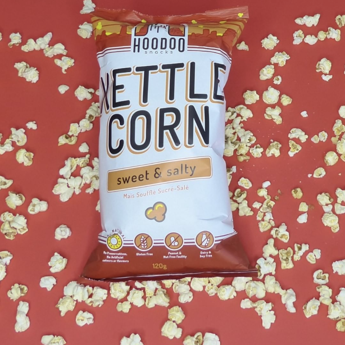
Inspired by the beauty of Alberta’s Lands and People, an identity was created for Hoodoo Snacks. The logo is a take on the iconic rock formations commonly found in Alberta. The goal was for it to be timeless, welcoming, and fun!
![](https://www.theakravision.com/wp-content/uploads/2020/11/HoodooSnacks_Logo-03.png)
Final logo on brand color palette
![](https://www.theakravision.com/wp-content/uploads/2020/11/HoodooSnacks_Logo_Sketch-scaled.jpg)
Logo sketch options
![](https://www.theakravision.com/wp-content/uploads/2020/11/HoodooSnacks_KettleCorn_Bag-proof-01.png)
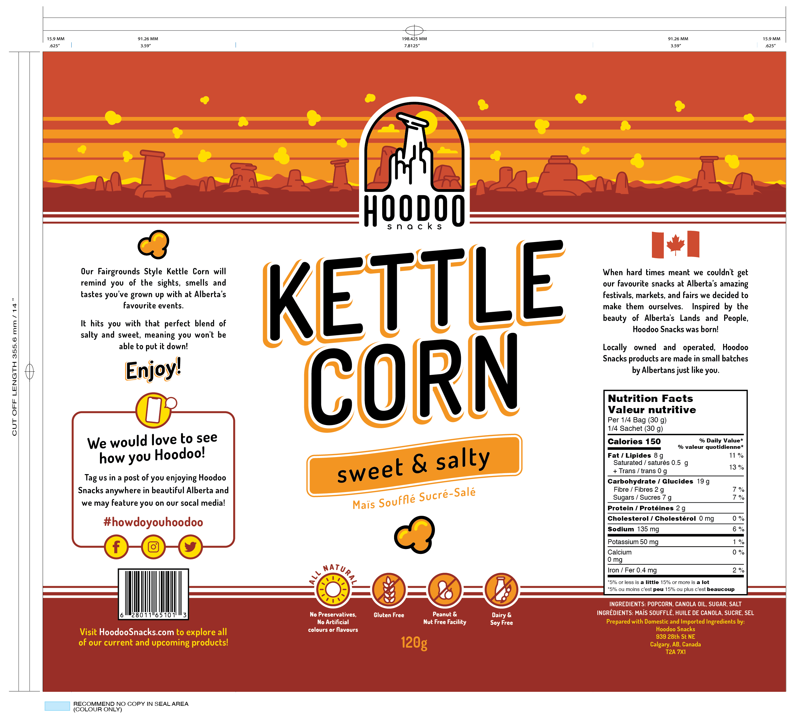
Kettle Corn bag design with die lines and measurements for production
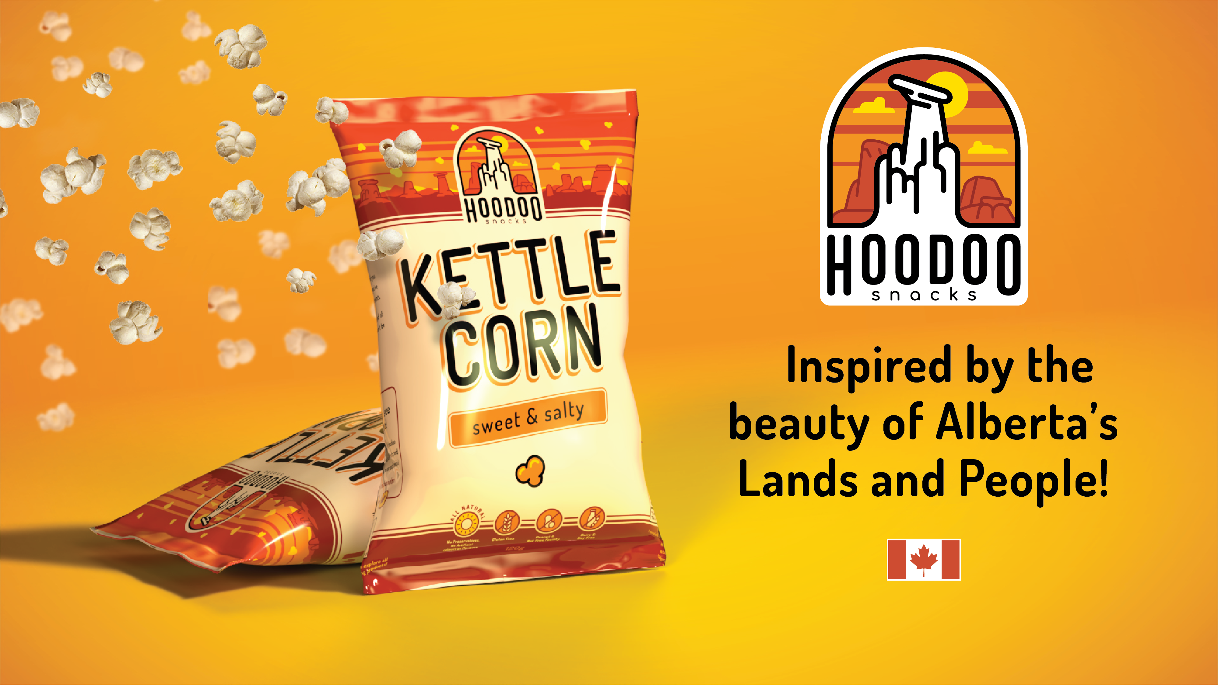
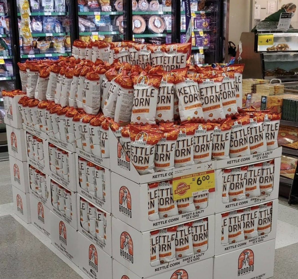
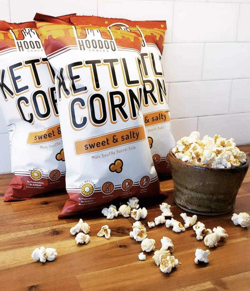
![](https://www.theakravision.com/wp-content/uploads/2021/06/HoodooSnacks_Baners-02.png)
Mock advert
![](https://www.theakravision.com/wp-content/uploads/2021/06/Screen-Shot-2021-06-16-at-2.09.24-PM.png)
![](https://www.theakravision.com/wp-content/uploads/2021/06/Screen-Shot-2021-06-16-at-2.12.14-PM.png)
![](https://www.theakravision.com/wp-content/uploads/2021/06/Screen-Shot-2021-06-16-at-2.11.37-PM.png)